Colour trends, such as the “Colour of the Year” influence homeowners, the paint industry, and even other industries like the fashion industry. But who are the trendsetters? Is it the consumers? Or maybe the colour consultants?
Indeed, colour consultants and theorists study society’s changing mood and tastes to gauge the newest colour trends, but they don’t set them. One might argue that we, the consumers, shape colour trends, and we do. But it’s really down to painting industry marketing representatives that research society’s mood and buying behaviour in order to set the trend for the upcoming year. Leatrice Eiseman, Executive Director of Pantone Colour, told The Atlantic that the process of choosing a colour can take years of research, in the case of Pantone’s 2014 colour “Radiant Orchid”, it was five years of research.
Pantone researchers draw colour inspiration from pop culture and global events. In the age of social media, these marketing reps even look at the top tweeted colours on Twitter. For example, in 2012, Taylor Swift’s album “Red” was most mentioned, followed by the colour blue featured in the presidential election and sports teams, etc. Clearly, each Colour of the Year and other colour trends, are not selected on a whim, but carefully tailored to you, the consumer, to convince you to buy a product.
We think it’s important to share the “Colour of the Year” from popular paint manufacturers. After all, better knowledge of the trends of a year does make for better marketing. As a result, homeowners, designers and building owners can benefit by keeping current with colour trends. And who doesn’t want to be trendy?
Check out Pantone’s historical “Colour of the Year” to see the colour palettes of different decades.
Colour Trends for Commercial Spaces.
There are many factors to consider when choosing office colours. Colour trends for the office may not be as influenced by yearly colour trends, but more-so by the company’s branding and working within the company’s budget.
For a retail commercial space, the psychology of colour certainly plays a role in influencing consumer behaviour. For example, a red accent wall may be a good feature for the sale section to draw attention. Branding and logos may play a part, but most logos use primary colours, and those colours do not tend to look good on walls.
Using the psychology of colour, retailers can evoke a certain mood in their shopping environment, such as calm or playful, depending on what kind of shopping experience they would like to give to their customers.
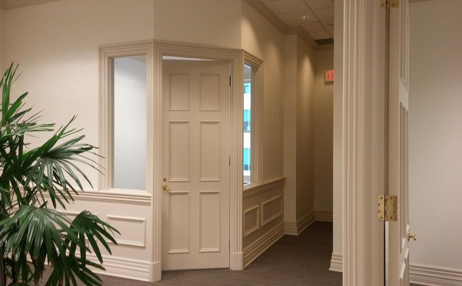
Corporate offices tend to play it safe colour-wise by choosing off-white or beige colour all over. This is because it’s hard to pick the wrong shade when you pick off-white, which makes budgeting more predictable, purchasing more paint at a cheaper rate, and it’s easy to match the furniture because everything works well with white walls. White looks crisp and will brighten up a room when there isn’t sufficient lighting (winter anyone?).
But frankly, there’s not a lot of personality with a white room. That’s why we love it when offices add a splash of colour to their white walls by adding a colourful accent wall or two. This satisfies the classic office aesthetic of white walls and keeping within a tight budget, but it also boosts the morale of staff by adding some eye-popping colour that’s sure to cure the Monday blues.
Colour Trends for Residential Spaces.
Homeowners may also be keen to know the year’s colour trends because they may want to modernize a dated room, gain some colour inspiration, or help narrow down the shade of green they want in their living room. Emerald green was Pantone’s colour of the year in 2013, you say? I’ll take it!
Homeowners want to find a colour that speaks to the style of their room and harmonizes with their furniture. Or they may want a lighter or darker shade to either blend in with or contrast with their furniture.
Colour consultants are colour experts that can help homeowners and businesses alike find the right colour for their needs. Ecopainting has many years of experience in helping clients sort through colour swatches to find the right colour.
Picking colours for a space may sound like something that does not need expertise. But if we remember all of the times we have painted and decorated, we also remember that we have picked a wrong colour for the furniture or space, and spent twice the initial amount to paint over our mistake and correct the initial colour choice.
If you can be particular about colours, too busy or working within too tight a budget to schedule your room being painted twice over, then consider a colour consultation and estimate with Ecopainting. Let’s bring your colour vision to life. Let’s do it right the first time!
Written by Julia Kota for Ecopainting.

