

How do you pick a colour for a room when you have so much choice? A home is a reflection of the people that live in it and their personalities. The colours we love to wear and the colours around us are proven inspiration sources. For most of us however, too much choice can be overwhelming. While there are no hard and fast rules – you can never go wrong with drawing inspiration from permanent architectural features. Whether you like neutrals or bolds – we hope the following tips will help you choose the right colour.
Pay Attention to the Architecture of the Home
Home is where we spend the majority of our time when not working. Some of the beautiful houses we see on television or in a magazine, always look perfectly aligned with their unique architectural style. A 1970s Victorian house for instance, will typically be painted with more somber colours that reflect the bygone era. Older homes like these had walls that were painted with colours that had a little bit of black added in.
As a painting contractor in Toronto, our advice to potential clients is to pick a colour palette that reflects the identity of their home. One doesn’t want a charming Victorian house to be done up in bright cheery blue! A somewhat subdued colour will not only bring back the old world charm but also give the house a renewal!
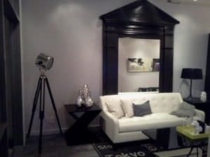 If possible, consider a home’s original architectural style (if it isn’t a modern construction). This will be a great starting point to find that perfect colour scheme. One of best ways to transform a room’s appearance is to enhance its architectural features. If a home has arched doorways, moulding, mantels, built-ins, windows or doors, all these provide the opportunity to include interesting colour.
In order to emphasize subtlety, doorways or moulding can be painted a shade lighter or darker. While the contrast is minor, it does draw the attention to detail. Other ways to incorporate beauty – paint a metallic glaze over an element with pre-existent paint, like a ceiling medallion. A bronze, copper finish provides a beautiful shimmer and is translucent enough to maintain any architectural features.
Another approach is to use two distinct colours in the same room. For example, a built-in bookcase can be painted with darker green in a room with grey walls. This will highlight the items on the bookcase.
Why not paint certain architectural elements with the same colour throughout the house? It will create continuity and flow from room to room and help anchor the overall design. Traditionally, white and off-white have been the colour of choice for doors, moldings and windows.
Take the Room Size into Account
Paint colours can make or break the experience of feeling comfortable in a room. The right (or wrong!) colour scheme can affect the way we view a space. It can also impact the perception around a room’s size or shape.

Different colours can create different moods and have varying effects on making a room appear larger, smaller, expansive or too cozy. Generally, cool and light pastels look farther away. Whereas, dark colours may feel like they are closing in on us. This concept can be used to make a space either larger or smaller, alter the shape of a room, enhance the positive aspect of a space and minimize undesirable features.
Here are some tips to change a room’s size and feel with paint:
Paint the ceiling: If you have a large room that feels uncomfortable, paint the ceiling darker than the walls to make the room cozier. On the other hand, if you feel claustrophobic, paint the ceiling a lighter colour which will create the illusion of a ‘higher’ ceiling. This will make the room seem more spacious. This idea isn’t limited to interiors. As a homeowner, you can also paint exterior ceilings, a soft blue on the porch ceiling can imitate the sky above.
Improve room dimensions: It is a well-known fact that lighter colours will enlarge a space. When different colours are used, eyes stop at the point where a colour changes. This is what makes the edges and the size of the room more obvious. With the same colour, our eyes do not perceive boundaries and the space just flows.
In contrast, a dark hue can make a room seem personable and cozy. There is a perception that dark colours make a room look dreary, cave-like and uninviting. However, this is not the case. If the walls are a deep shade, and the trim is either white or a really light shade, the borders of the space are more noticeable. The trim needs to be painted in light colours to stand out. If it is painted a similar colour to the wall, the eye won’t stop at the border but hover around the room. So once again, you have the expansive feel whether you like it or not.
Similarly, with long narrow spaces (think corridor-like!), paint both end walls a shade darker than the other walls so they feel closer to you. If it’s a long narrow room you’re painting, it will appear to be square. For large, bare walls, variety is the spice. Break up the space with moulding, paint different colours below and above. Don’t forget to use the darker colour on the bottom to enhance continuity.
Do you have an ugly AC or heating vent that needs a disguise? These are features we’d rather get rid of but cannot as they are essentials. Painting such eyesores the same colour as the wall will make them ‘blend in’.
These are just a few suggestions that will help accentuate a room’s dimensions and take the attention away from the less desirable features of the space.

Don’t Forget the Lighting
Paints tend to reflect light depending on what time of the day it is, as natural light changes during the day. As a rule of thumb, painting a few swatches on the wall and checking them at different times of the day can help determine the best colour for a space.
More often than not – we look at glossy magazines or websites when deciding the colour combination when painting a home or a room. However, that isn’t the right approach. Most home interior pictures (whether online or on paper) are taken using supplemental lighting which does affect your viewing experience.
It is okay to be inspired by the photos you may have seen, but don’t forget to experiment with the lighting plan before the painting begins. Working within the natural and artificial lighting limitations will help you get that perfect colour!
A home may be painted gray all over, but differences in shades will arise due to the room angles and placement. Colours also look different depending on the circumstances. As the day progresses, the natural light in room changes, seasons too affect the way paint shows up. Ever noticed a couple of candle lights – the way they instantly soften an otherwise dark room. Recessed lighting can affect the appearance of painted walls too. It is definitely a good idea to paint samples on walls before committing to a colour.
Here’s how to use lighting and paint to:
- Cool down a room’s colour: Choose a bulb with temperature close to 4,000 Kelvin. A standard fluorescent will cool down a room but make sure to check the numbers.
- Warm up a room’s colour: Pick a bulb with 2,700 Kelvin. Halogens should work but there are plenty of other options with warmer ratings.
- Replicate natural daylight: A midday sun is 5,000-6,000 Kelvin. While this may seem like a big number, it is in fact very cool light.
Personal Accents
Once you have narrowed down your choices by architecture, room size and lighting – you’ve most likely arrived at the colour of choice. If for any reason, you are still confused, it may be time to consider the personal accents and artifacts in the room. A room is more than just paints, walls and furniture. There could be throw rugs, wall art, drapes that all have unique colour and character. Use these items for inspiration. Find a colour that isn’t overwhelming to the space but is present in more than one location.
Ecopainting can help with your colour choices and can offer painting services in Toronto when it’s time to start your painting project. The colour consultants we work with are experienced and fully certified.
Call us at 416-733-7767 and meet with one of our representatives. We will listen to you and help you pick a colour palette best suited to your budget and decorating priorities.